How to Make a Chart in Google Sheets
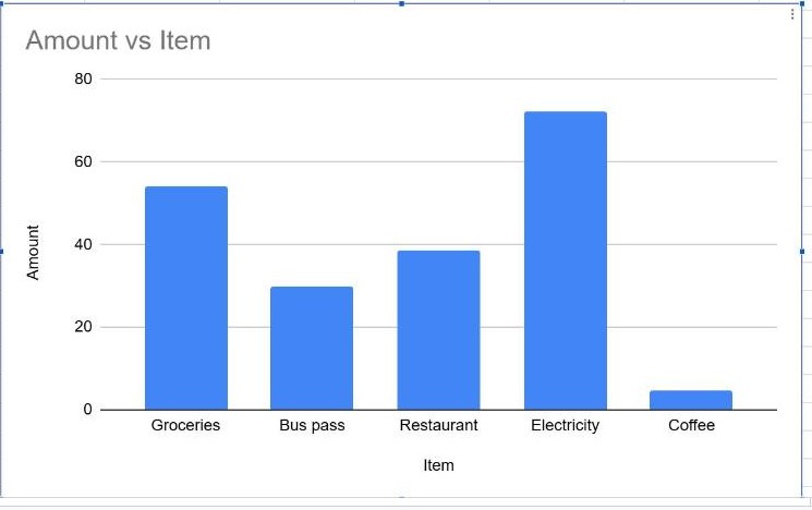
A chart turns a column of numbers into something you can understand at a glance. Google Sheets builds one from your data in two clicks and suggests a chart type automatically; the chart editor lets you change everything else.
Insert a chart
- Select the data you want to chart, including the header row. For example, the item names and amounts in
B1:C7. - Go to Insert → Chart.
Sheets adds a chart to the sheet and opens the Chart editor on the right.
Choose the right chart type
Open the Chart type list in the Setup tab to switch types. A quick guide:
| Chart | Use it to… |
|---|---|
| Column / Bar | Compare amounts between categories (expenses per item, sales per region) |
| Line | Show a trend over time (monthly revenue, weekly visitors) |
| Pie | Show parts of a whole, with only a few slices |
| Scatter | See whether two numbers are related (price vs. units sold) |
Tip: if a category label is long, a bar chart (horizontal) is easier to read than a column chart.
Customize titles, colors and labels
Switch to the Customize tab in the Chart editor (Customise in UK English):
- Chart & axis titles – give the chart a clear title, such as "Expenses by item".
- Series – change the bar color and turn on Data labels to print each value on its bar.
- Legend – move it or set it to None when there's only one series.
- Horizontal axis / Vertical axis – change font size, number format and the minimum or maximum value.
Move, resize or delete the chart
- Move: drag the chart by its edge.
- Resize: click the chart and drag one of the blue handles.
- Edit later: double-click the chart, or click it and choose the three-dot menu → Edit chart.
- Delete: click the chart and press Delete.
To give the chart its own tab, open the three-dot menu and choose Move to own sheet.
Frequently asked questions
Does the chart update when my data changes?
Yes. The chart is linked to its data range and redraws automatically. If you add rows below the range, edit the Data range in the Setup tab to include them, or use a whole-column range such as B1:C.
Why does my chart show the wrong data on the axis?
Sheets may have guessed the layout wrongly. In the Setup tab, try Switch rows / columns, and check that Use row 1 as headers is ticked.
How do I chart totals per category?
Build a small summary table first with SUMIF (one row per category), then chart that table.